

Realism and the Suspension of Disbelief
Looking at the prominent animation and VFX films of the past few years, it seems that we are finally easing off from the drive for realism, and in my opinion this is fantastic news. Allow me to start explaining my relief by comparing two franchises that aren’t completely animated, but do consist of fabricated images.
The second we see Kermit the Frog on screen we immediately accept him as a living character, even when we can see Jim Henson operating him. Yet when we watch a film like Dawn of the Planet of the Apes we spend the entire time thinking “wow the VFX are great”- and while that is at least a positive response, it may come at the expense of the audience’s disbelief, and harm the viewer’s experience.
So why is that? Is it simply that Henson was a better performer than Serkis? That may be part of it, but I am convinced that it is largely due to Henson’s approach to stylisation (deliberate or not).

Kermit is very obviously a puppet. We notice this immediately and swallow it anyway because Henson isn’t really hiding it. DotPotA keeps the audience questioning the images as most people aren’t familiar with their creation process.
When making a film, if you expose your technique from the start, the audience will feel invited to accept it and get on board with the content of the film more readily. If you conceal it and try to sell to the audience that the talking Chimp is real, then they are less likely to invest themselves in the fiction because they dispute with you that it isn’t real.
A stylised image is at once not real, and, with a good designer, looks intentionally not real without sacrificing so much detail that the characters can’t be manipulated expressively. Mickey Mouse doesn’t look like a real mouse, Nor Bugs a real Bunny, etc.
Most of the classic Disney films open on long establishing scenes that take a while to get to the main characters, with only incidental animation. This has a great effect in suspending the audience’s disbelief in a relatively short time. Before anything important happens, the filmmakers show us that we ‘re looking at moving drawings and paintings and as we get closer to the main setting/characters we’re invited to keep watching anyway. That establishes a great author/audience relationship and it doesn’t matter if you’re showing Pinocchio as a bunch of cels, Godzilla as a guy in a suit, or Gromit as a lump of plasticine. The point is to have the guts to show your audience that your material is fiction.
It doesn’t take long to establish this, and you don’t need to preface your film with a “Making of”. You can show it in the images themselves by employing design.
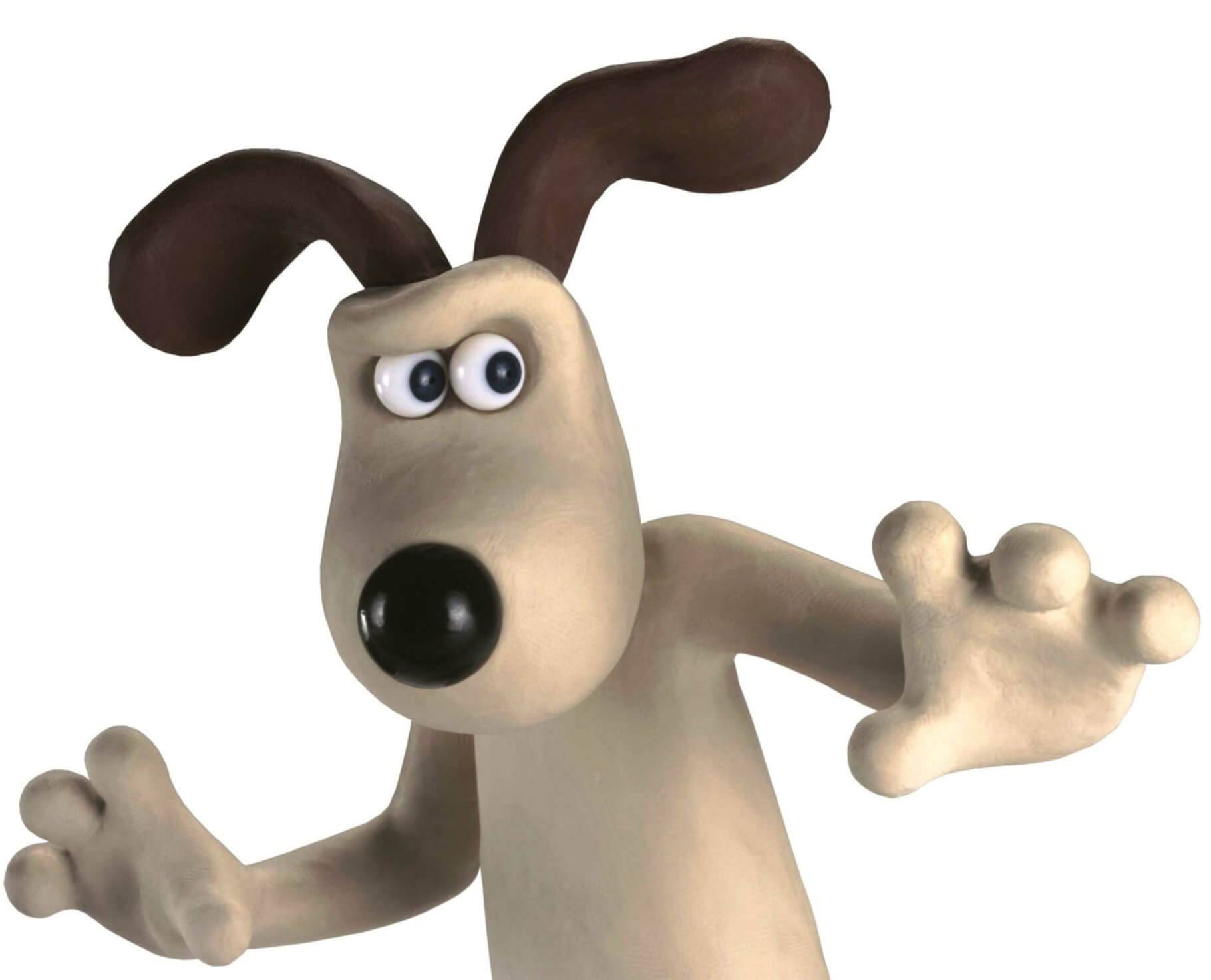
Gromit – more than just a lump of plasticine
In the past this was not a problem as hyper-realism wasn’t available, but now I refer to it as ‘stylisation’ because we have the option to employ realism in different shades as a design choice. Unfortunately “as realistic as possible” is the prevalent goal in CG rendering today. It seems that films have inherited the drive for realism from the video game ‘Console wars’ wherein the different console manufacturers try to prove the superiority of their product by making evermore realistic renders at the cost of aesthetics. As far as I understand, it’s difficult to look like you’re not attempting realism in CG as the software is generally designed for realistic rendering. Traditional animation doesn’t suffer from this as badly because even the most genuine attempts at realism are transparently drawn.
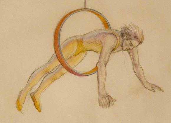
Richard Williams’ short film ‘Circus Drawings’ animates relatively realistic figure drawings. They don’t look like photos, though. (Richard Williams/Imogen Sutton 2010)
With this in mind, Disney’s recent shorts Paperman and Feast are a step in the right direction. While a similar look could have been achieved with drawn animation in Photoshop or TVP, it’s exciting to see them begin to move away from realistic rendering because the sooner we as film-watchers stop being impressed by ‘good graphics’, we can have richer experiences with the films we watch.
For further reading on this subject, I’d recommend: David O’Reilly’s Essay ‘Basic Animation Aesthetics’
Scott McCloud’s book ‘Understanding Comics’
And Richard Williams’ chapter on ‘The Great Realism Debate’ in the extended edition of his ‘The Animator’s Survival Kit’ book, which you probably have already.