Storyboarding Tutorial – “The Do’s and Don’ts”
Have you ever walked through an animation studio and conducted a poll as to who is a storyboard artist, and who is not? I have, and the results were staggering. Apparently, EVERYONE is a storyboard artist. Or rather, everyone THINKS they are a storyboard artist. Have they ever done it professionally (gotten paid for it) though? Probably not. Have they actually seen one of their storyboards put together on an editing suite, complete? I doubt it. One cannot be an effective storyboard artist without learning the rules of storyboarding from people with experience, and by making mistakes themselves and realizing those mistakes. Also, the best storyboard artists are people who have been animating for a number of years because they are more able to assess what will be the best angle to animate, and what will be too hard to animate.
I was one of these people who believed I was a storyboard artist too, a long time ago. I was given a swift dose of reality though when I saw one of my boards completed through animation and on the editing suite. There were mistakes, and I mean huge glaring mistakes which cost the company I was working for a lot of money to fix. I look back at it now as a learning experience and chuckle, but then, it was not very funny, as I came dangerously close to losing all credibility, and possibly my job.
That being said, many years have passed now since I learned how to do storyboards, and since then, I have done a great many. Now, I intend to shed some light on storyboarding for those of you who are still insisting you are storyboard artists, yet have no experience doing them. I will shed light on the “glaring mistakes” most commonly made, the “do’s and don’ts”, and things to watch for when trying to tell your story pictographically. Hopefully, by the end of this little lesson, some things will be etched into your memory for future reference so that one day, you might be able to do a board and actually get paid for it.
Rules in Storyboarding
1. Every scene must serve a purpose
When creating your storyboard do not cut to another scene, unless there is a reason to do so. Very often, I see unnecessary cutting, and all it does is confuse the viewer. Many times, board artists think they are creating an artistic mood in rapid cutting, but this is not always the case. If you do see something cutting quickly from scene to scene, it will more often than not be because the sequence is an action sequence. But the camera is still cutting for reasons, and not just because it is an action sequence. These reasons could be to focus on a foot impacting another character’s face, and then cutting to see a longer shot of the character who just had his face kicked hitting the floor, and then it cuts to show the attacker attack further, etc., etc. There is always a reason to cut though; something to show.
Cutting is used to shift the audience’s focus to important aspects of the story. For example, a character puts down a glass on a table after drinking from it. Not very interesting is it? So why cut to a close-up of the glass being placed on the table? Stay on the full shot of the character. Now if there is visible poison (for example) on the rim of that glass, and you want your audience to see it, THEN you can cut in close to the glass being placed on the table. This cut serves a purpose.
I am sure that many of you have seen two characters having a conversation together in a film or show. The two characters would be visible talking together, both on screen, and then there would be a cut in closer on one of the characters, and then even closer to that character again. Nothing really happens, but the board artist/director thought maybe the shot was lasting to long, and wanted to change it up a bit to break the monotony. However, this is not the way to do it. You cut in closer on a character in order to see his expression more clearly, or something of the sort, but never just for the sake of cutting out of a scene. This is one of the most common mistakes I see with younger board artists, and honestly, it drives me nuts.
—
2. Do not move the camera unless necessary
Young board artists tend to make a camera move in every scene, or close to it. I do not know why they do this, but it is certainly not benefiting your film, and making it more aesthetically pleasing to the eye. Actually, it makes the viewer dizzy at times. Personally, I try to use camera moves as little as possible. I might use one for an establishing shot at the beginning of the sequence, but more often than not, that is all. Use camera moves to reveal jokes, or again, to direct the audience’s focus to something necessary for the comprehension of the story.
This is actually a problem more prevalent in 3D animation. I do not know why (but I have my theories), but 3D animators tend to make their camera move in every single scene of their work. I think it is because they had spent so much time in modelling their sets that they do not want any of their hard work to go wasted, so they make the camera revolve around the action so that the audience can appreciate their hard work too. This is the complete wrong approach and should be avoided, no matter how big the temptation may be. Show your hard background work in your establishing shot, and that is it. After that, it is just accompaniment.
Many people use a camera move because their original staging does not work for the entire scene, so they “adjust” the framing as necessary. Sometimes this works and can be effective, but normally, it looks like the board artist was too lazy to re-lay his/her scene out to work throughout. Sometimes this is impossible to avoid, but should be avoided as much as possible.
—
3. Watch for “jump cuts”.
A “jump-cut” is a cut from scene to scene that appears to “pop”. It usually comes from cutting from one angle/framing to a very similar angle/framing. This is very jarring to look at, as it will appear that things in your scene (i.e. character) will jump into their new position in the field.
When cutting to a new angle on a character, a storyboard artist needs to make sure that the camera in the new scene is dramatically either closer or further away to that character. If the character is too similar in size, your scene will jump-cut. A rotation will not solve this at all either.
The bottom line is, you must be sure that your character is framed dramatically different from one scene to another, or you will have a major problem In our film. Some people (directors, usually in live action) use jump-cuts for artistic purposes, but it is very hard to get away with, so it is probably best to simply avoid it.
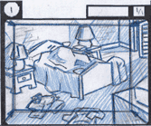
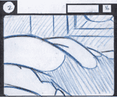
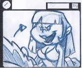
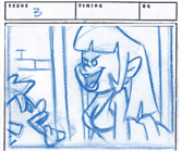
(ABOVE) Notice the cut from scene 2 to scene 3. With this cut, only the camera angle changes slightly, thus giving the character a popping effect. She will appear to change in position just slightly, and the result will be jarring for the viewer.


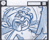
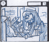
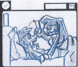
(ABOVE) Here you will see that I cut to a close-up of the male character first in scene 3 so that we could see his excited dazed, love-struck expression, and THEN cut to the profile shot of the two characters. This allows for a smoother transition, and the cut will not jump.
—
4. Watch your composition
Be sure that you make the most of your negative space. Don’t draw a little tiny character in your frame, and nothing but background around him, unless you are doing it for a reason, such as showing how alone the character is, for example. If your focus is on the character as a whole, be sure that the character fits (just fitting all of the character and his action) in the frame. You want your shots to turn out as interesting as possible.
You should try as much as possible to show some depth in each shot as well. By using foreground elements sometimes you can achieve this. By setting up your scenes so that they are not shot straight on the character or in a straight profile, you can achieve this as well. These two angles, unless done for an artistic reason should be avoided, as a profile or straight on view of a character is more often than not ugly as sin.
On a side note, an over the shoulder shot of a character speaking with another is a lot more interesting to look at than a straight close-up. The over the shoulder shows the relation in space between the two characters and adds a bit of depth to your scene.
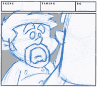
(ABOVE) An example of over the shoulder. Notice the small amount of negative space in the scene, and the scene is filled up with characters, which is much more interesting to look at than empty space (background). This also adds a small sense of depth to the scene, and if one really wanted to get artistic with the scene at compositing stage, a slight blur could be applied to the girl in the foreground, adding to the depth effect.
—
5. Watch your axis
In a scene, there is an imaginary line, called an axis. It is a line that your camera can never jump across. Consider, if you will, two characters speaking to each other. The axis would be found by drawing a straight line through the centers of these characters. You cannot cross that line, and if you absolutely NEED to, you have to cut first, placing your camera on the axis, and then you can cut to the other side.
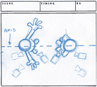
(ABOVE) In this setup, we see two characters talking. Notice the dotted line drawn through the two characters. That is the AXIS. DO NOT CROSS that line with your camera. You can place your camera anywhere you want on one side of the line, but if you do want to cross it, you first need to cut to an angle where the camera is ON the axis, and then you can go to the other side.
—
6. Avoid complicated angles
It is highly recommended that you avoid overcomplicating your camera angles. If you do not NEED to have an extreme up-shot or down-shot (again, only do these if there is a specific reason for doing so), then do not do them. It makes your scene very difficult to animate, and the end result could be something very atrocious. You can usually get your point across visually without overcomplicating things, so I suggest that is what you do.
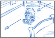
(ABOVE LEFT) This is an example of a shot to avoid. An extreme down-shot is extremely hard to draw ONE frame of, let alone 100.
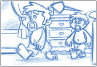
This is a better solution. You could also, to make matters even easier, do a straight profile of the character walking across the screen, but it is not as nice to look at. This character is still walking in perspective, which some people still have problems animating, but at least, the character is level with the camera, so it is much easier to draw.
—
7. Be sure that your animation and camera instructions in your action columns are extremely clear.
Chances are that your work will be done by more people than just yourself, so you want to make sure that anyone can understand what you want and what you have illustrated in your board; especially someone who might speak a different language than you, as chances are that the animator will in fact speak a different language.
—
8. Watch your continuity
One of the most common mistakes found in storyboards is a lack of continuity. You need to make sure that everything remains constant throughout a sequence. Characters need to be in the correct positions from scene to scene, and you need to keep track of where they move to. Props need to be all accounted for, and sizes or characters and objects in the background need to be followed closely.
Now with 3D animation, this has become less of a problem, as the same set and layout is used for the entire sequence, and if something is not working correctly in the storyboard in regards to continuity, it is usually caught quite early and flagged. However, in 2D, the case is, more often than not, that the layout artists/animators tend to draw exactly what they see in the storyboard, correct or not. Most of the work is now done in Asia or some such place, and the people there are not paid to think about the continuity, so they don’t. In this case, you need to make sure that your storyboard is exactly on the mark to ensure that later on you are not surprised when you see your compiled line tests and realize that the sequence does not work, and there is nothing you can do about it because the animator is not at fault, and the scene is in his possession in Asia somewhere.
—
9. Don’t be lazy with your poses
A lot of people try to take short-cuts when storyboarding, and put as few poses into their board as possible. They assume that the animator will use their imagination and make the action work, and act naturally. The problem is that many animators believe it not to be their job to think about the action so much, and don’t; especially if they are foreign animators being paid minimal salaries to get the job done.
Be sure to put a start pose and a final pose, to ensure that your scenes will match-cut properly. In addition, act your scene out heavily and include any movement you envision for your character in the form of another pose in another panel. Once you have the first panel drawn and the composition worked out, additional panels do not take nearly as long to draw, so include as many as possible. If you want to add some more poses later, you can draw small thumbnail poses in the action area of your storyboard, labelling them with numbers, and indicate in the dialogue with those numbers what pose goes where.
—
10. When necessary, be sure that your light source is indicated
If your film has shadow effects in it, you will want to make it clear as to where your light is coming from. If you do not, an animator will (more than likely) take it upon himself to put the shadows wherever he wants to, which will probably be in the place that will make the least amount of work for him. This will make some mass confusion, and your shadows will be all over the place from scene to scene.
Draw and shade your shadow areas, or simply indicate your light direction using an arrow (if you really want or need to save some time). Drawing and shading your shadows is the best approach though.
—
11. Make sure your characters are acting in the correct camera direction
When characters are speaking, and you are cutting from one to the other and back again, etc., you must make sure they appear to be speaking to each other. If one character is speaking to screen right, the other character must reply to screen left. Otherwise, they will not appear to be speaking to each other at all, and the audience will be confused. This is particularly a problem when cutting from a close-up of one character to a close-up of the other, and your scenes will jump-cut (the first character will appear to magically turn into the other).
Also with camera direction and characters’ interaction in the camera, be sure that if your character is exiting for example in one scene and entering in the next, that they are moving in the same direction. It is very jarring to see the character exit screen left and then in the next scene, enter from screen right.
—
12. Keep in mind that all important action should happen center screen
Keep in mind that there is a safe frame that you must keep all important action inside of. Some televisions cut off close to 2 full fields from each side of your image, and if your action happens within those 2 fields, it could be lost to a lot of your audience. You always need to envision a frame inside your storyboard frame and keep it all inside it.
Many people have a tendency to always put a character’s eyes (the character who the focus should be on) exactly in the center of the screen. This is the wrong approach. You should favour the character to one side or the other, so that there is less negative space behind them, and more in front of them.
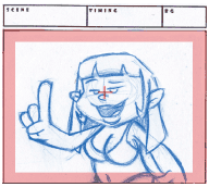
(ABOVE) This is wrong. It is not terribly pretty to look at, and there is too much negative space behind the character. The red area is the T.V. cut-off.
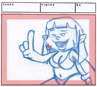
(ABOVE) This is better. The character fills the screen better, and there is much less useless space behind her.
—
13. Be sure that your posing is strong
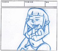
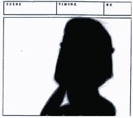
Posing needs to be strongly drawn. There needs to be a strong line of action, and the characters’ poses need to be well silhouetted. This means that if you were to colour your entire character black, you could still tell what the character is doing. You achieve this by ensuring that you draw the characters’ arms away from the body, instead of in front of it, etc.
(ABOVE) This is an example of a weak pose. Look at the black version on the right, and notice that you cannot see what it is, or what the character is doing.
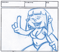
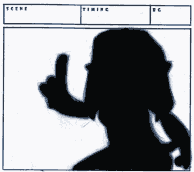
(ABOVE) This is a better pose. When painted black, we can see what she is doing by way of the negative space around her.
— End of article —
These principles and rules work for any medium of film. Do not think that they are simply limited to animation. Cinematography is the same throughout the film industry. Now that you know all these rules, you will be able to watch live films, and spot the directing mistakes.
Keep an eye out for the next guide to the storyboard process. We will explain the process in which most storyboard artists go through in order to ensure their cinematography is strong and stories well told by way of their storyboards.


