


The Films of Michael Dudok de Wit – Interview & Competition
With two years having passed since the Cannes premiere of Michael Dudok de Wit’s stunning Academy Award-nominated feature The Red Turtle the film, now available to buy, holds up as an utterly engrossing modern folk tale. Driven by absolutely masterful animation executed by a team of artists with a staggering attention to detail and character performance, this film boasts a joyful interplay between its visuals and a divine orchestral score by Laurent Perez del Mar. As a celebration of both the unforgiving brutality of nature, as well as its life-affirming beauty that lingers with the audience for long after, it’s clear that the film is not just a worthy addition to the Studio Ghibli canon but a truly remarkable reminder that 2D animation as a feature film medium remains enchanting and compelling.
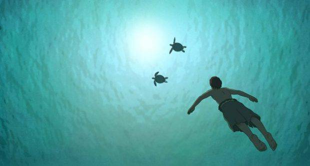
The Red Turtle (Dir. Michael Dudok de Wit)
The seeds of the film’s brilliance, as one might expect, can be found in Michael’s prior short films, a body of work that earned the director an Oscar win and a firmly-cemented place as one of modern animation’s most respected and influential storytellers.
While Skwigly were already privileged to speak with Michael about The Red Turtle at the time of its wider 2017 theatrical release, it was a further honour to meet during our mutual involvement in the Dublin Animation Film Festival and hear his reflections on the earlier work that both established his name and led to The Red Turtle’s creation.
In childhood, Michael recalls, his early artistic fascinations centred around (predominantly Belgian) comic strip artists.
There was a culture of drawing at home because my mother could draw really well (she could have been an artist if that was a priority for her – it wasn’t) so as a child she made sure there were always pencils and papers lying around. I was encouraged to draw and, luckily, my parents had the wisdom not to impose their vision on what a beautiful drawing is, or what the subject of the drawing should be, they were just happy that my brothers and I felt free to draw anything anytime.
Having grown up on a steady diet of commercial American animation from Disney to Hanna-Barbera, it wasn’t until stumbling upon Vladimir Jutriša and Aleksandar Marks’s 1966 animated Croatian short Muha (The Fly) at a local art exhibition that Michael realised animation’s greater, albeit less commercial, storytelling potential.
It was a short animated film that was dark and not funny. Instead of terminating with a gag, it came to a shocking conclusion; it was a symbolic expression of a political situation. It was so individualistic and powerful that I was bowled over, I thought Why haven’t we seen more of this?
This initial curiosity would fade and lie dormant until Michael found himself in art college when it was promptly reawakened through his enthusiasm for narrative art as seen in such magazines as Heavy Metal. Refreshed by the boldness of the artists and artistry as well as subject matter that wouldn’t shy away from mature subjects such as sex, violence, politics and even mysticism, Michael came to realise that it was a medium that had the potential to reach a significant audience.
At the same time I went to see my first animation festival at Annecy in France. This was in 1975 and I watched all the films, which was easy back then – you could start early in the morning and stay out ‘til midnight. I also observed the filmmakers and they generally had several things in common. There were no inflated egos, they were very ordinary people, passionate about their art, not pretentious, quite open-minded, traveling a lot, exploring symbolism and strange metaphors with their work. Then I totally realized I’m home. I’ve arrived. This is the universe that works for me.
Shortly after this revelation Michael began working in the South of England before moving to London to begin a fruitful freelance career in animated commercials, as was (and remains) the case for many promising animators to cut their teeth in the world of animation production and, on occasion, flex their creative muscles.
It was a period when animation was quite creative. The sales message had to be relatively discrete because in the UK it was considered bad taste to be aggressive with your sales. That was, of course, ideal – to make a beautiful, thirty-second film that could attract an audience for its own beauty and originality. Art college had been great as a springboard but in commercials I really learned how to swim, how to explore and, most of all, how to be a professional, working with deadlines and teams.
You also have to learn how people perceive your animation. As an animator it’s very obvious to you what is clear and what is not, but once you get your first feedback – in my case from an advertising agency – and you realize that intelligent men and women don’t see your work the way you do – or have questions, or get confused – then something wakes up in you. You realise that, to work with an audience, you have to be aware of how audiences see films. It’s an obvious lesson you learn sooner or later, but for me it was very sudden and very clear that I had to learn how people perceived film. That fascinated me – and I’m still learning now, of course. It’s not one lesson, you learn throughout your whole career.
Tom Sweep (1992)
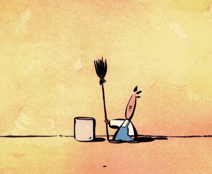
Tom Sweep (Dir. Michael Dudok de Wit)
While Michael had dipped his toes in the waters of short filmmaking with his 1978 thesis film The Interview (which has remained largely unseen until recently surfacing as a supplemental feature on the Japanese release of The Red Turtle), it wasn’t until over a decade later that he would helm his first professional film Tom Sweep in 1992. After several bumps in the road while attempting to secure funding from such organisations as the BBC, the NFB and Channel 4, the film ultimately got off the ground as a pilot of sorts.
A series is almost like making a short film but it has a commercial value, so if it’s good it’s easier to get funding. Tom Sweep had an ecological theme that I liked and felt would also appeal to some funders. The series never drew enough attention to get made, but I got funding to make the pilot, which I see as a short film in itself, so I’m very happy with it.
The Monk and the Fish (1994)
The genesis of Michael’s next film The Monk and the Fish proved quite different, with the director getting wind of a new initiative from French studio Folimage that offered European artists six-month residences to create new shorts that would supplement their established output of children’s content. As one of the first artists to pitch for a spot, Michael initially attempted to develop an already-storyboarded project, although soon discovered it didn’t have legs as a short. Starting from scratch, he endeavoured to create a new original story that came from a deeper place, created not exclusively for entertainment but to establish himself as a serious storyteller and filmmaker. For Michael, the success of the project was a make-or-break affair.
If it wasn’t selected (by Folimage) then I would either leave animation altogether or accept that I should concentrate on being a commercial animator and be happy with that. So it was a little bit of a turning point.
Fortunately the selection committee would indeed offer Michael a spot on the strength of his new storyboard The Monk and the Fish – before they had seen it in its entirely, no less. While the film’s production was, on a technical level, consistent with his experiences as a sometimes-creative freelancer, having complete creative control over his own work proved to be an altogether different experience.
With commercials you can’t be sloppy, you can’t be too ‘arty’ unless it’s very clear in the brief, because it’s a commercial and needs to relate to a large audience. With The Monk and the Fish the visual look and the technique was strongly influenced by my experience of commercials and, looking back, it was very professional – the editing, the design, the colour scheme, all of that I think worked well. The subject was different because it’s more of a poetic film, especially the ending, which is the most important part, in a way. That’s why I made the film, but the ending doesn’t work if you don’t create anticipation that moves toward it. You need to create a whole story to make the ending completely acceptable; it’s not a gag, or a political message, or any other message.
The story of the film begins with a monk spotting a fish occupying a water reservoir by his monastery. Instantly captivated by it, he attempts to capture it using initially conventional means that grow more elaborate and absurd as the fish continues to elude him. Of all of Michael’s films it is The Monk and the Fish that most prominently showcases an intuitive sense of comedic performance and timing. The quality of movement imbued in the titular monk as he relentlessly pursues the fish is as unique as it is endearing, bounding from pose to pose in a frenetic yet simultaneously graceful manner. In an approach not dissimilar to such classic animation as Fantasia or the more musically-driven Warner Bros. shorts and others of their era, the interplay between Serge Besset’s score and Michael’s animation is where much of the magic lies. The film also establishes a hugely sophisticated approach to light and colour, the textural quality of the film owed to it being hand-painted with Indian Ink, with adept shadow work playing off the line art that gives the monk’s relatively simple design a real sense of depth.
While the film proved demanding of Michael’s time and personal efforts, after having worked in commercials for so long the comparative perks that came with directing his own film were clear from the start.
The other thing that was totally different – and blissful – was that I noticed within weeks of working on The Monk and The Fish I was sitting at my desk in Folimage in France, starting on layout, and I thought I don’t need to show this to any committee or advertising agency – I can decide myself when it’s good enough. It’s a big responsibility, yknow, six-to-seven months’ work of your life. But it’s really nice not to have to wait for the approval of an official producer or a team from the advertising agency. So that’s a big difference, that it comes from a personal place. It’s subtle and poetic and I didn’t know how many people it would resonate with. Luckily most people loved it for what it is, although I’ve met people who said they don’t understand the film. I totally accept that, I understand there are people who are really used to a more rational completion of a story, they want it clear and logical like a fairytale, for instance, with a very distinct message at the end. So I was very, very relieved that a poetic film like this immediately worked well at festivals – right from its premiere in Portugal it continued to do well and it gave me enough confidence to write the next film.
Father and Daughter (2000)
Following the immediate success of The Monk and the Fish Michael, now teaching at the National Film and Television School, planned on creating another film in a near-identical style, this time set in Ancient Greece. After creating several drawings and finding himself stuck on developing the synopsis into anything substantial, he took a step back and re-evaluated what it was he really hoped to explore at that time as an animation storyteller.
It all fell into place surprisingly quickly and simply. I wanted to express deep longing, not for a holiday or a partner or a career but even deeper than that. This longing is beautiful, there’s something very pure about it. It’s a form of suffering but it’s the best version of suffering I know! I wanted to express that in a film and stylise it in the way of a child longing for her absent father.
Although securing finances from the Netherlands proved relatively easy, the remaining funds that would guarantee the film’s completion were not in place when Michael broke one of his own cardinal rules and began production. Fortuitously, during that crucial time fellow animation director Paul Driessen, about to take a two-year sabbatical from his post as an animation professor at the University of Kassel, reached out to Michael to have him take over. While the travel proved exhausting, the highly-paid one-week-per-month of teaching abroad allowed Michael to make up the remaining required budget through self-financing.
While an exceptional film, Father and Daughter served as a clean break from the comedic absurdity of The Monk and the Fish while retaining Michael’s gift for textural artistry and atmosphere. While his last film had focused on the concept of pursuit, the story this time around would be one of yearning. A young girl and her father travel to his moored boat in which he sets off to sea while she remains on the bank, watching him go. With a similar energy to the monk of the previous film, the little girl bounds excitedly, awaiting his return. As time passes and she returns to the same bank year after year, from a young lady to a grown woman, the energy quickly dissipates to be replaced with a patient, hopeful longing. Getting glimpses of the life she leads and the woman she has become, we see that she remains committed to her father, although we never learn of his destination or what fate might have befallen him. Foreshadowing major themes of The Red Turtle, the film follows the daughter throughout her entire life through the recurring location of an endless ocean that she is forever tethered to.
In a quasi-imitation of a watercolour aesthetic,the look of Father and Daughter was technically achieved using a combination of charcoal and digital processes in Photoshop. It was the stark difference in tone and pacing, however, that most set the film apart from its predecessor.
In The Monk and the Fish I played with synchronization where, almost like a music video, the animation would synchronize to the music with hardly any sound effects. The style of the animation was very snappy, very free and cartooney – not exactly cartooney in a Tom and Jerry way but a style containing fast movements, little holds and stretch and squash. It’s very enjoyable for an animator, that style.
Father and Daughter was a bit slower and a bit more contained, and so is visually very different.
The film took two years to make, spread over four years because of the teaching. That’s quite long for a short film but I really felt very precious about telling almost the whole life of one person in the space of about eight minutes without rushing through it, without listing the daughter’s main activities in her life, keeping it very stylised, very simple, because it’s about one basic emotion.
Father and Daughter immediately performed well at festivals, hailed as a critical triumph to this day and winning multiple awards across the globe including a BAFTA for Best Animated Short in February 2001, followed by an Academy Award for the same category the following month.
After the film won an Oscar, I immediately noticed one change: the recognition I got as a short filmmaker from friends and family members who had previously been slightly condescending toward short filmmaking. Then they saw it win this very prestigious prize and something shifted in them and they thought I was actually doing quite well! That didn’t affect me in a practical sense but I felt my profession was treated with a bit more respect – and an Oscar is obviously the best advertisement you can imagine for a film.
Several commercial opportunities that would shortly come his way, including a series of AT&T commercials and a contribution to a United Airlines campaign that was embracing the talents of similarly-accoladed directors (such as Joanna Quinn and Alexander Petrov), all of which directly evocative of the distinct world created for Father and Daughter. The return to commercial animation, albeit for Stateside clients with more of a focus on artistic approaches to advertising than aggressive sales, proved “hugely enjoyable” for Michael, now firmly established in the animation industry and artistic community.
The Aroma of Tea (2006)
Some six years later Michael would return to shorts with The Aroma of Tea, his last to date and a curious departure from all that had come before. Though visually striking, the narrative elements of his prior work take a back seat to a far more experimental and abstract approach, the only character to speak of a small dark spot that travels through a variety of intricately painted environments that, while not immediately identifiable, alternately resemble burrowed tunnels, microscope slides and calligraphic brushwork.
I was into exploring different sides of myself, of my creativity, and I had a real desire to make a semi-abstract film, very simple, small budget, only three minutes, to existing music. Things just clicked and came together. My love for the elegance of Chinese and Japanese calligraphy, my passion for the particular piece of music and the story itself I really liked, it’s almost non-narrative. It got funding very easily because it was cheap to make. It was all Dutch money and some French money and I made it mostly by myself, together with a good compositing expert.
Michael’s enthusiasm for the music in question, Arcangelo Corelli’s Concerti grossi, Op. 6 (No.s 2 and 12), is consistent with all of his films including The Red Turtle, relying as they do on a sophisticated interplay between score and visuals, the former oftentimes driving the latter. More unique to The Aroma of Tea is the material used as a substitute for paint or ink – tea, as the title would suggest.
Initially I planned to make the film with ink and then, almost playfully, I thought Is there anything else I could use that would be really interesting? My idea was to experiment with highly, highly concentrated tea. It becomes a very dark brown liquid, like thick ink. It was related to the title because there is something about tea which is very pure and simple and very complex at the same time, and very Oriental. I thought it suited the film, the title alludes to the ink, which is tea, but it also alludes to the finesse of tea itself and the finesse of smelling.
I felt very confident that there would be an audience for an abstract film, simply because I’ve seen many in festivals. They don’t attract the biggest reactions, they’re usually less liked than narrative films, but they do attract attention, just from a smaller audience. But when the film was finished I was surprised by the reactions of some members of my family, friends and the animation world, asking me “Why did you make that?!”
I realised that yes, for some this kind of non-narrative art without very clear characters is too new, too unusual. To me the film is very accessible if you just relax and enjoy it. I guess some people tried to understand the film on an intellectual level and then I think it loses its quality.
Hear about the making of Michael Dudok de Wit’s stunning feature film The Red Turtle in episode 71 of the Skwigly Animation Podcast (stream below or direct download):
 The Red Turtle is available on DVD/BD and digital now via StudioCanal.
UPDATE: Our contest giveaway has now closed. Thanks to everyone for participating and congratulations to Skwigly reader Kate Muldowney for winning her copy of the film!